Sharpness test
Here is a really Amateur Test
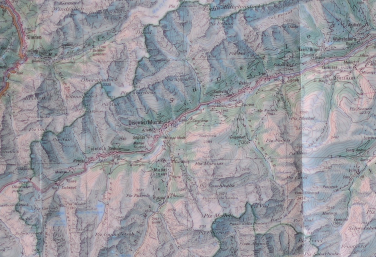
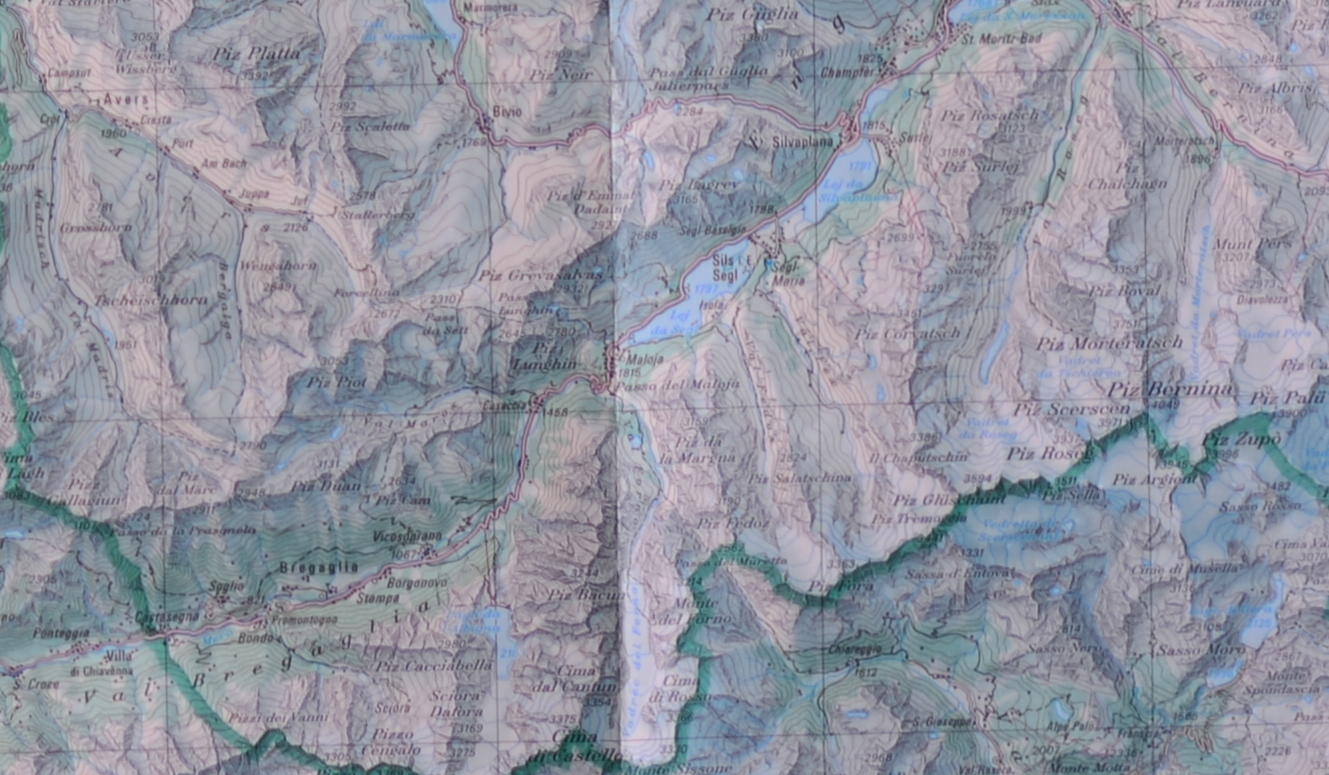
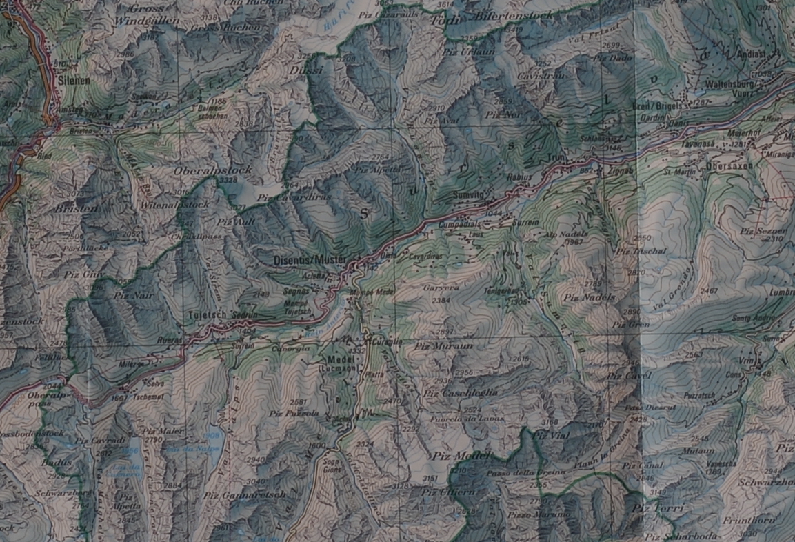
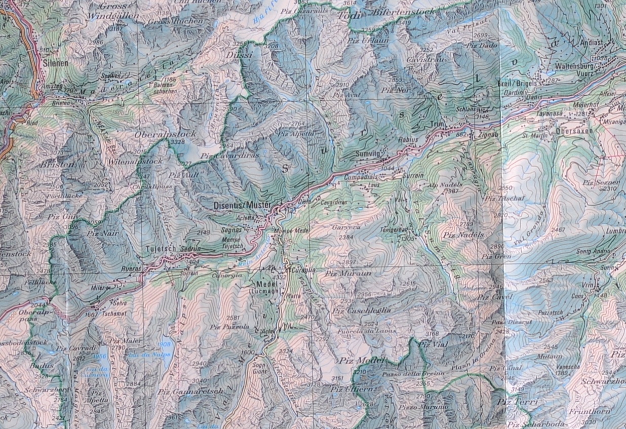
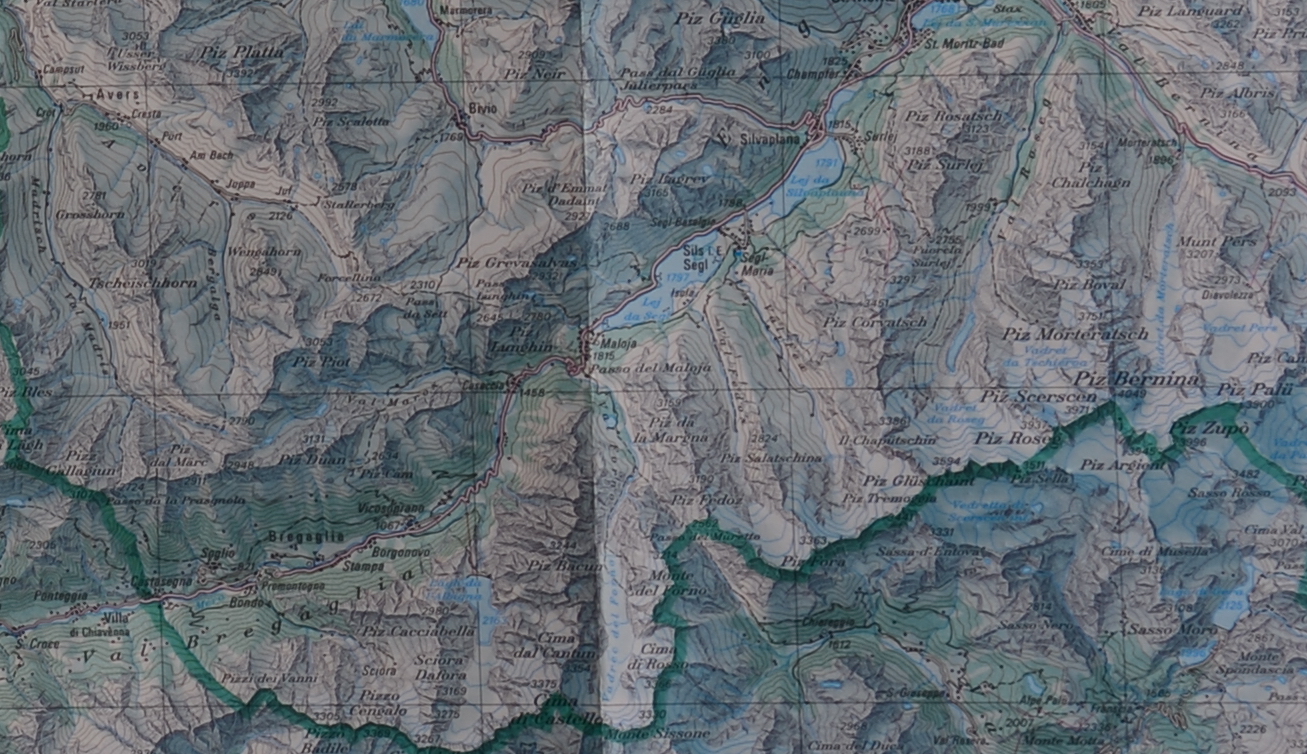
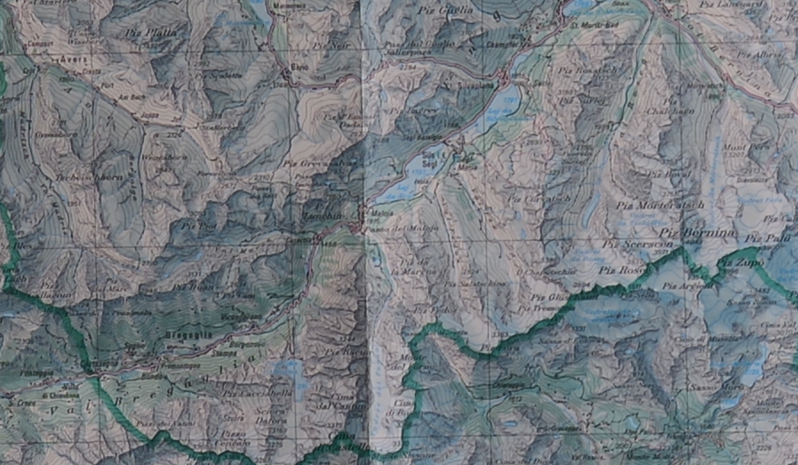
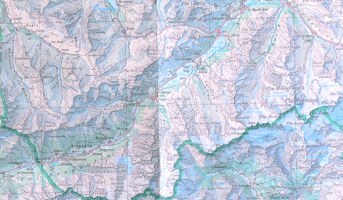
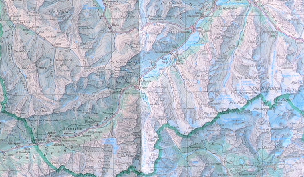
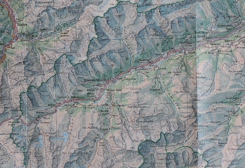
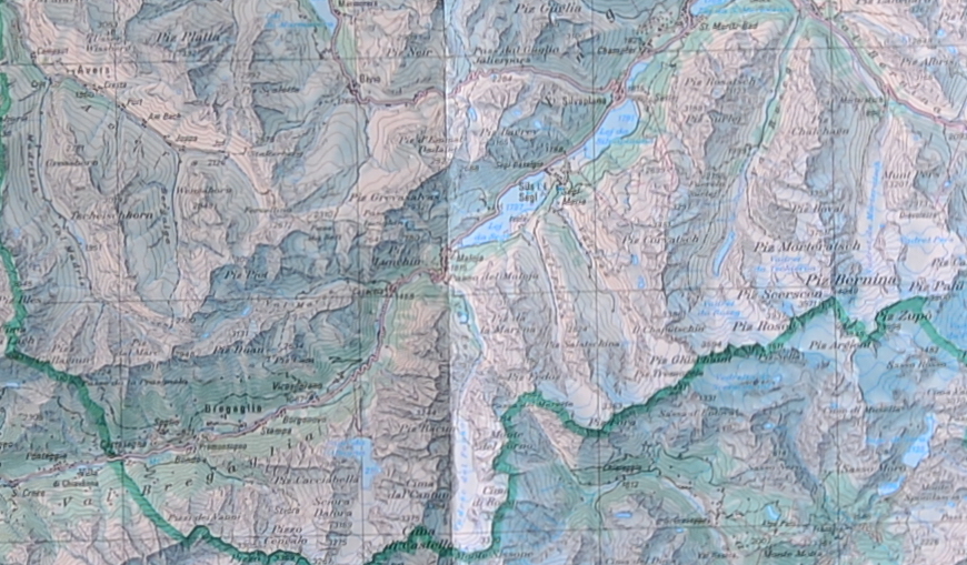
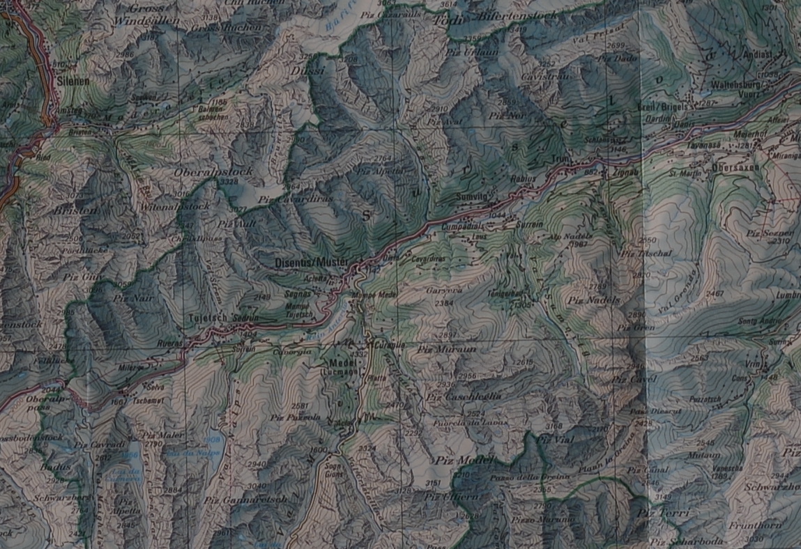
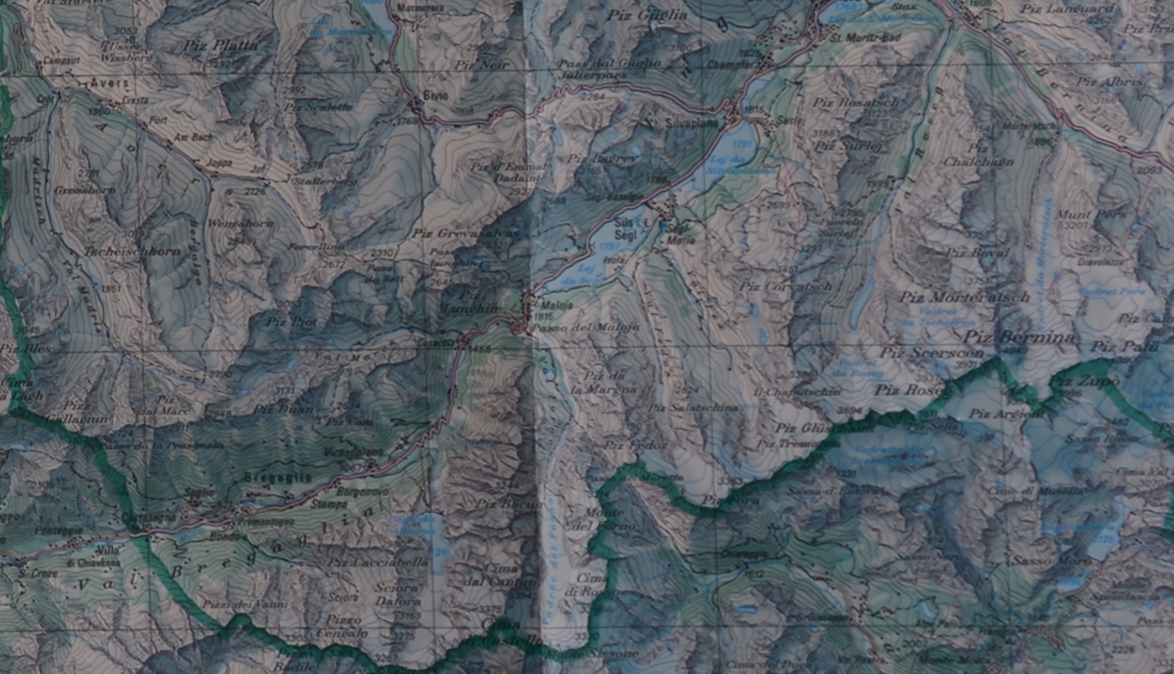
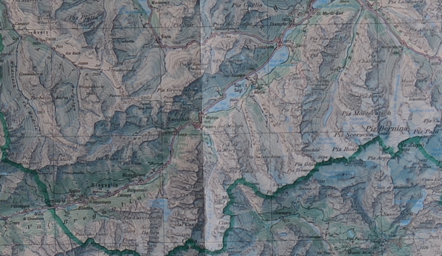
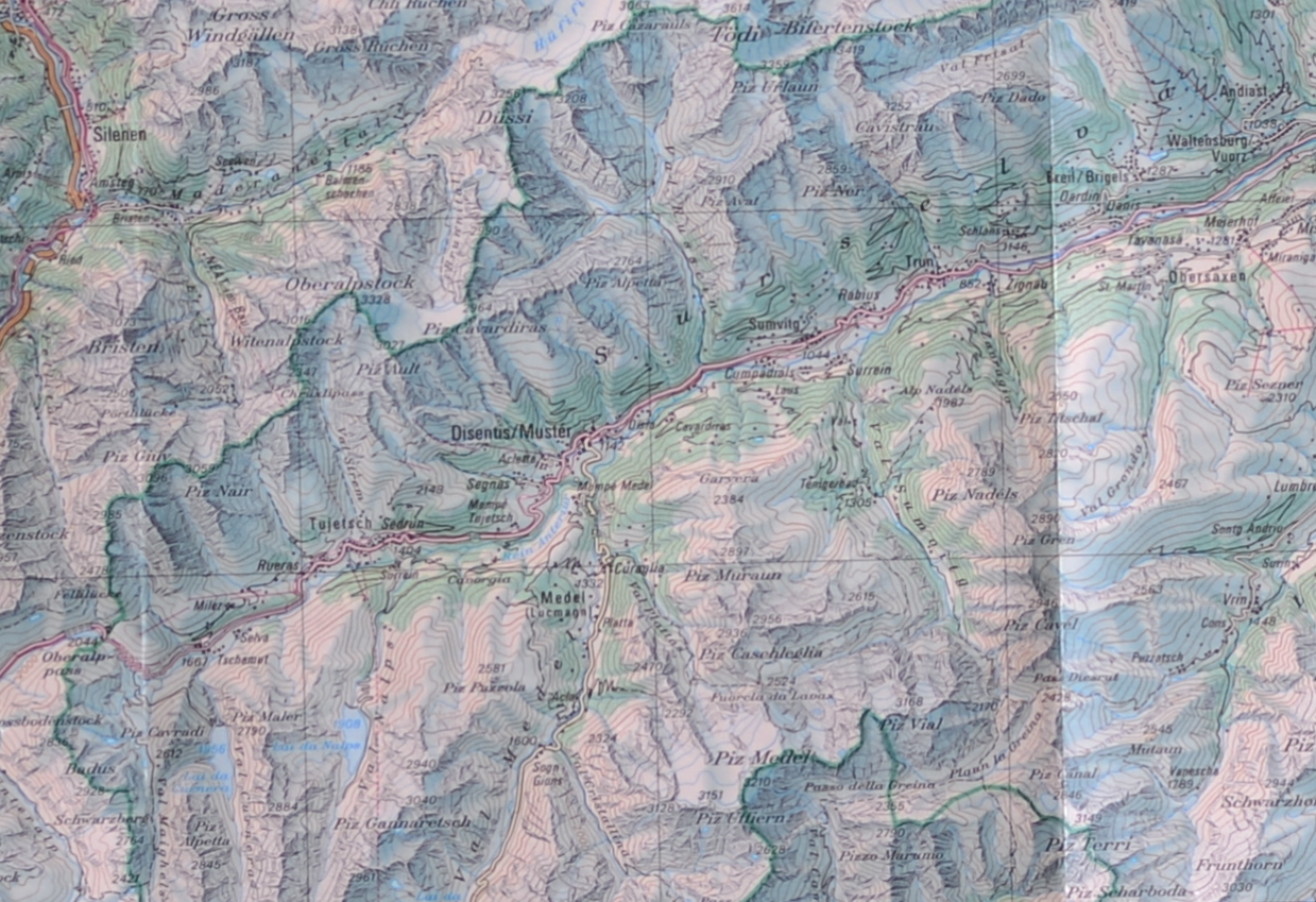
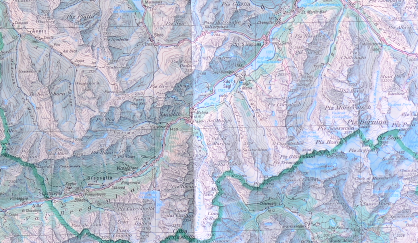
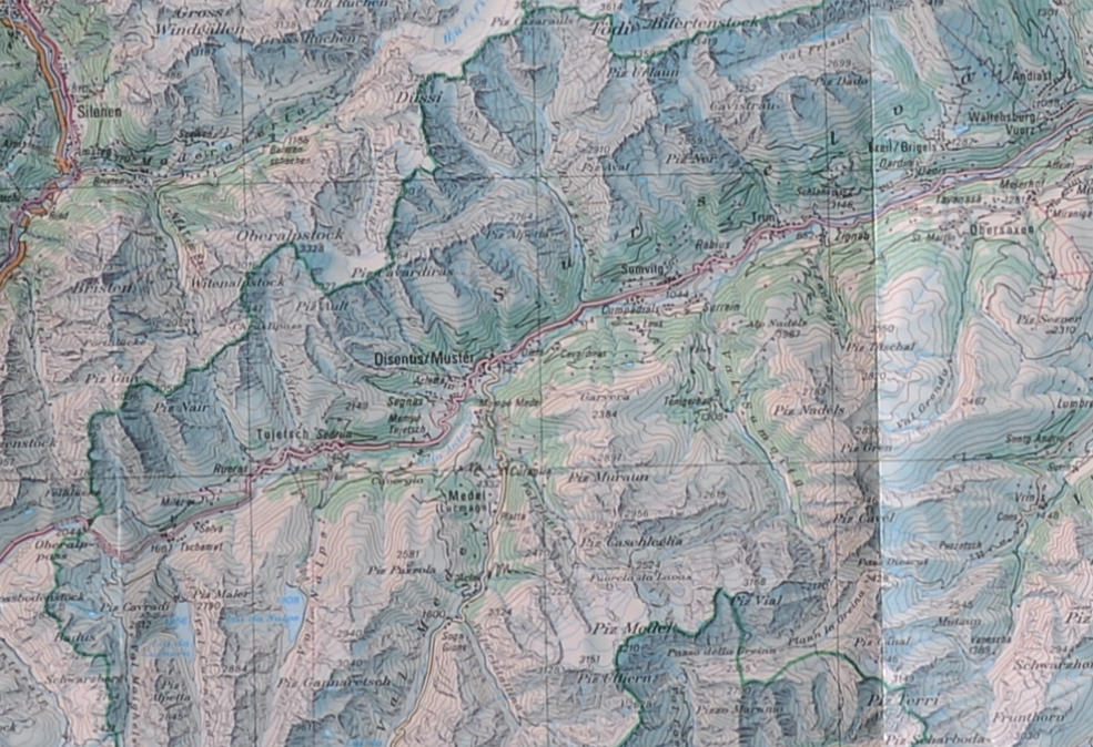
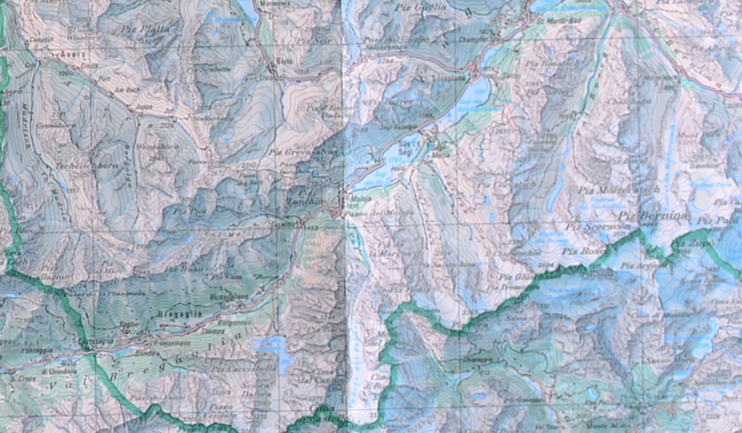
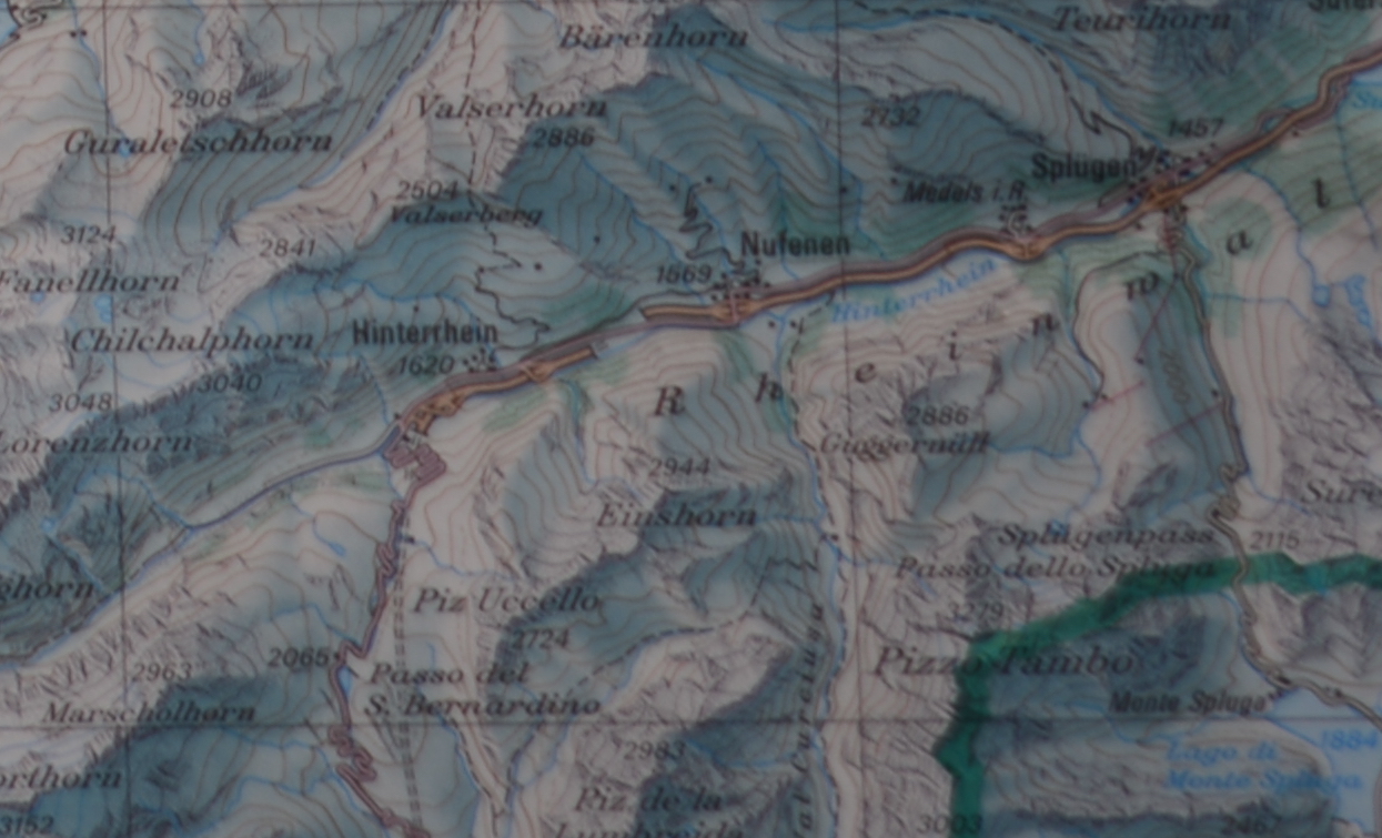
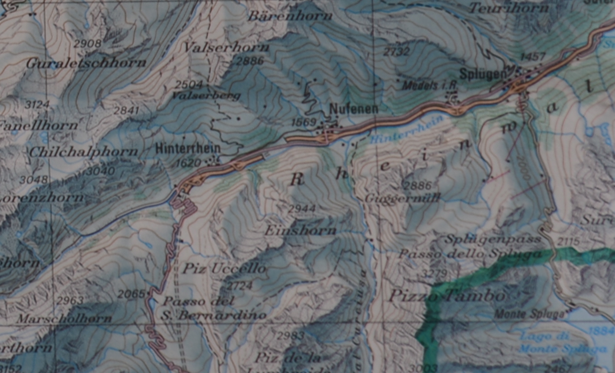
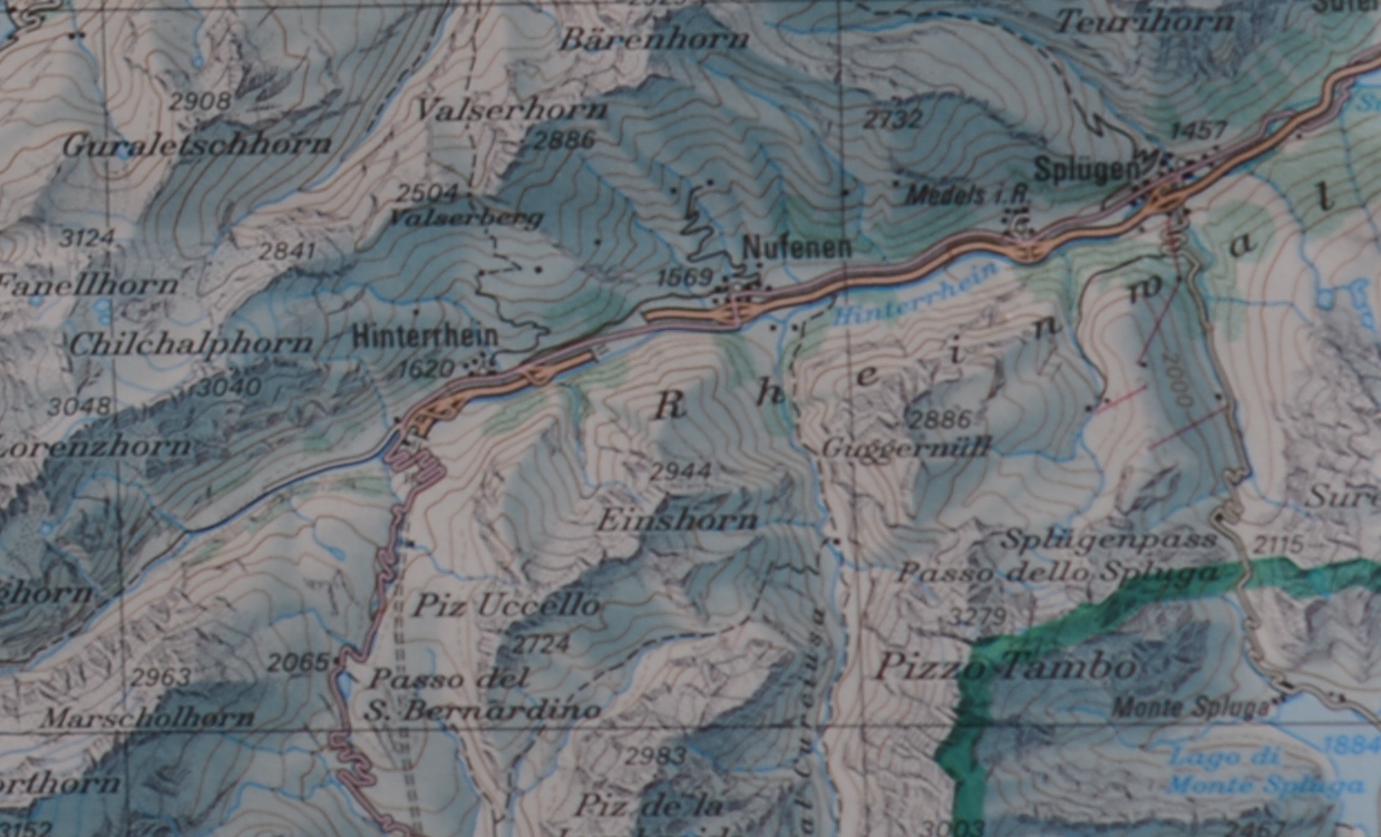
I took the best camera I had (Nikon D850), mounted it on a tripod and took pictures of a map on my wall with a couple of different lenses. This is what happened.
What is the story
For only 20, I ended up buying a used Soligor 35-200 lens. While trying out in the office, the lens actually looked very nice. Then I took it out for a trip, and I was quite disappointed, there were some serious issues with sharpness in the pictures. It is easy to blame the lens in these cases. Everyone does, so did I. After a while I decided it would be a good exercise to make a couple of simple test pictures to highlight things for the Quality of photographic equipment page and show what a really bad lens looks like. So I pitted this lens against some of the more renowned lenses I had around.
The setup
I used the Nikon D850 on a tripod, the wall was about 3 meters away and the room was lit from the side through the window with sunlight. I used the lowest ISO setting of the camera, left the camera with auto exposure (which in hindsight was not so smart) and used a timer to take two pictures. I manually choose which of the two shots are better. I made shots with three different aperture setting,
- the fastest that the lens would allow,
- a constant f/5.6 which was a compromise aperture,
- and f/8 traditionally regarded as one of the sharpest settings before diffraction starts taking over.
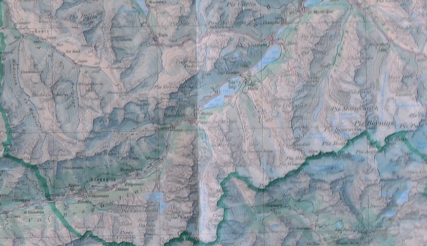
Afterwards I selected geographic locations on the map and cropped the pictures accordingly. Only one set of figures had to be scaled down to 1280 pixels wide as at 200mm focal length the area was too big and the file exceeded the maximum file size. This version is not being used for the comparisons.
The lenses and focal lengths used are:
- Soligor 35-200 at 70mm and 100mm (there is also a set of results from 200mm, but they are not in the comparison directly. I bought this lens for 20.
- Nikon 85 considered to be one of the sharpest prime lenses
- Nikon 105 the macro lens for the Nikon
- Nikon 24-70 a much celebrated and expensive zoom
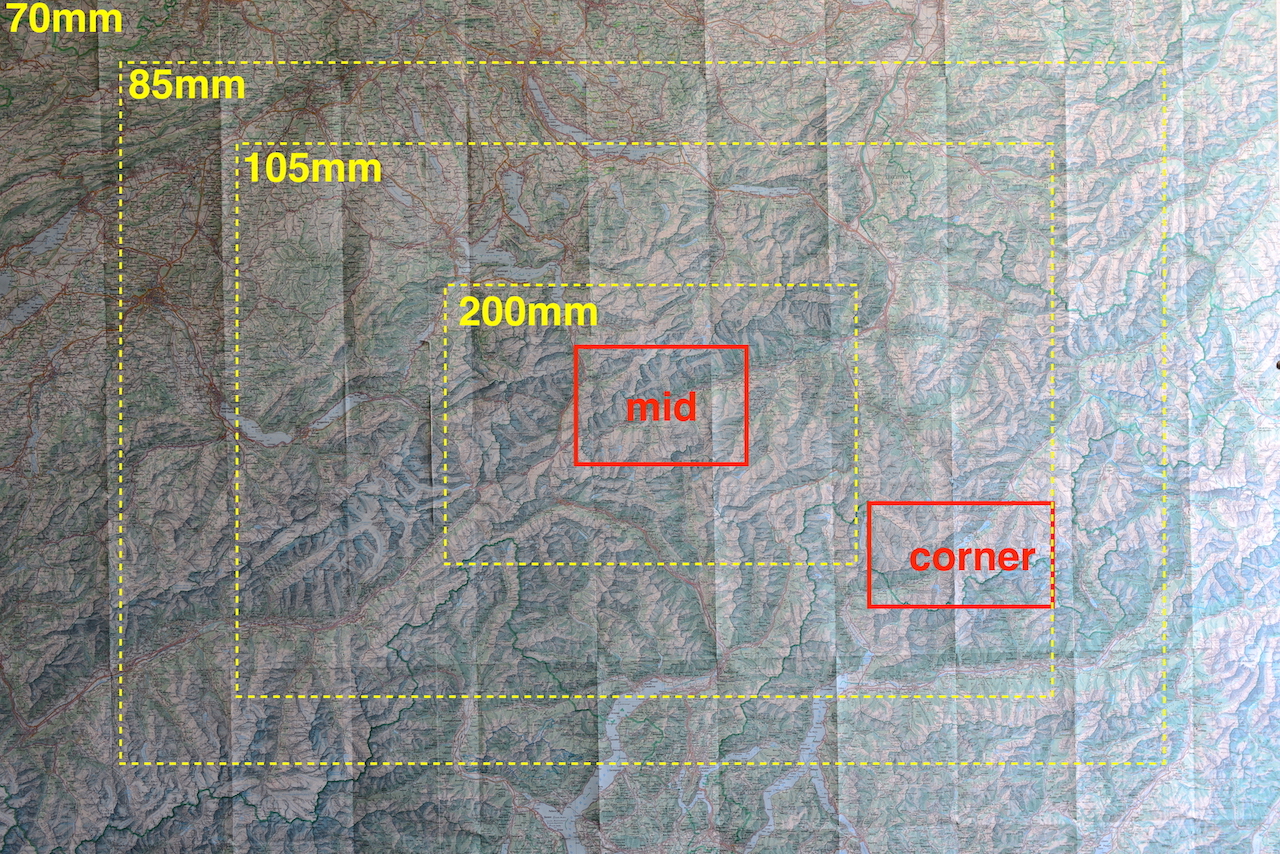
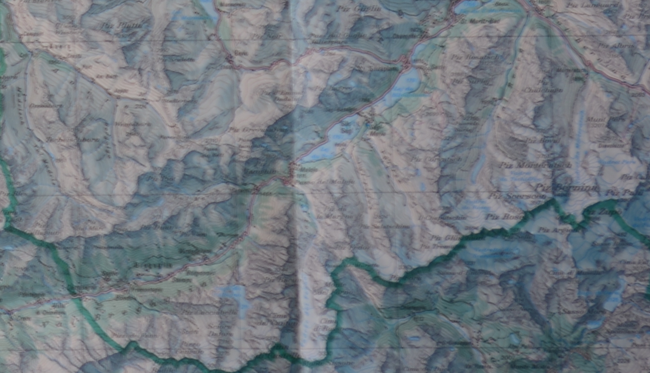
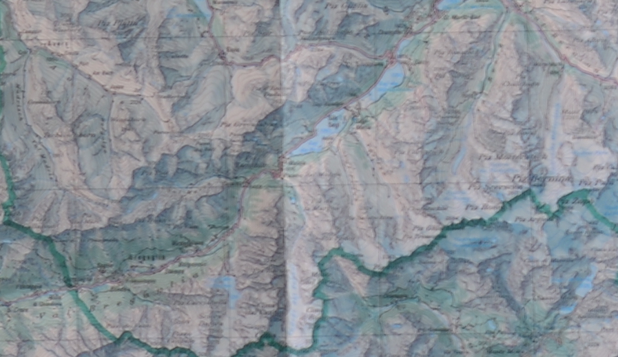
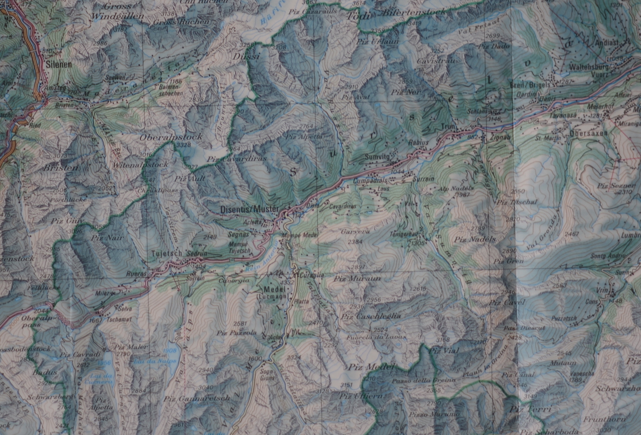
For fairness in the first part, I have coded the lenses A, B, C, D, and E. At the bottom there is a full comparison with all pictures, where the lenses are also identified (you can also click on individual images to see what they are). The following is the overview of the image that was used for everything. Map on the wall is actually a very good test subject. It has uniform detail and is (almost) straight.
Problems
This is not at all like the nice laboratory comparison pictures. There is plenty of things wrong here
- Seeing as how much aperture played a role, I should have used a smaller aperture as well. Probably fastest, f/11 and slowest would be a better measure than what I did.
- I let the camera in the Aperture Priority setting. Not all lenses had the same light reading as a result there is quite a bit of variation with the exposure time even though the same aperture was being used.
- One of the lenses had a tinted filter that I did not realize (or was too lazy to figure out at the time).
- Regardless, using natural light from the side was not a good idea. There was not much variation in the actual light conditions as all shots were taken within about 10 minutes.
- The light also interfered with what I would take as the corner. I wanted the top left, but it was too dark in some pictures. So I had to choose a corner where there was more light. This sort of countered the falloff (more light on the corner) which was not fair.
- I am not 100% sure if the focus was correct for all. When in doubt, the focus was manually corrected/checked using 'live view and zooming in digitally.
- As not all lenses use the same focal length, for some of the lenses the corner was not so much of a corner (it was closer to the middle).
- Again as not all lenses use the same focal length the zoomed areas have different number of pixels. No scaling was made, so pictures may also look different because of that
The result
- These comparative setups are not so easy to set up
- Even the cheapest lens can produce sharp images and even the best lens can produce blurred images. You need to pay attention.
- The most important issue for edge to edge sharpness on a flat surface is smaller aperture. At f/8 most of these shots looks quite good and the differences between the lenses is much less than the difference between the same lens at different apertures.
- The quality of photographic equipment is for me a bit different. While the sharpness here may be OK, I have a much easier time working with some lenses than the others. For me the main quality is how easy the lens makes me to take the picture I want.
- I thought the Soligor 35-200 would fare much worse in this comparison. It didn't or at least not that much.
- Still the Soligor 35-200 is not as good as the other lenses. While it does not show here, getting good pictures with it requires more work.
Middle at fastest aperture
Ok, let's not spoil things here, but this one should convince everyone how difficult (and senseless) these comparisons are. Lenses that are really fast will look worse here than lenses that are much slower (due to aperture).
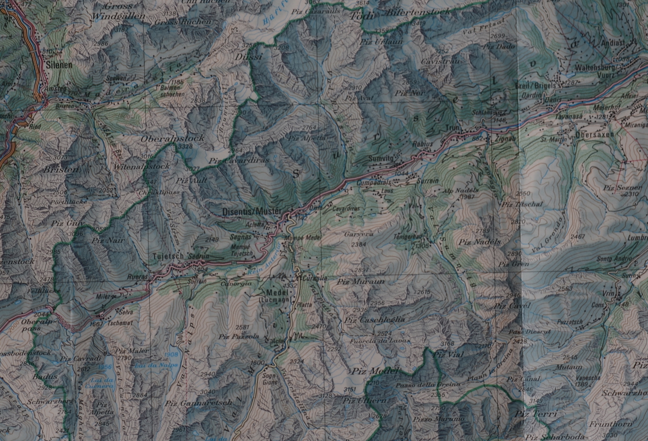
Corner at fastest aperture
Maybe one thing to consider is how much the quality changes when you move from the middle towards the corners. Note that the lenses that have the focal length longer have shots from further towards the corner (i.e. the quality is supposed to be worse). But let's say these are the sorriest looking pixels of the bunch.
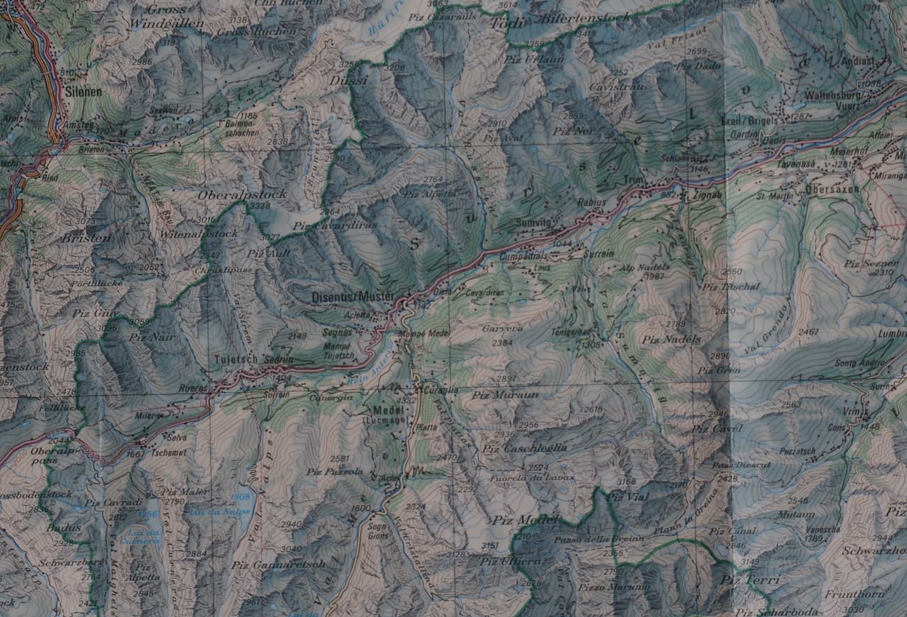
Middle at f/8
So, when you set the aperture to a decent value where the lens can is sharper, all of a sudden all these pictures look quite good (note that the under exposed darker pictures are my fault).
Corner at f/8
And they also look good on the corners? If we would add price/performance as a criteria there would be some big losers here. My point in that quality of photographic equipment is more than measurable numbers actually.
Side by side at f/5.6
These shots are at the compromise aperture f/5.6 and for each lens show the middle and the corner section side by side. The darkness of the images come actually that the aperture priority mode ended up choosing a slightly shorter exposure time. I should have used a full manual setup where the exposure time as well as the white balance was fixed, but I was lazy.
All pictures
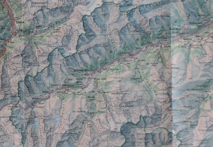
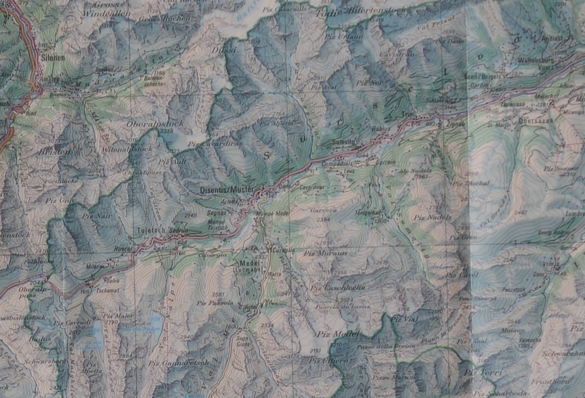
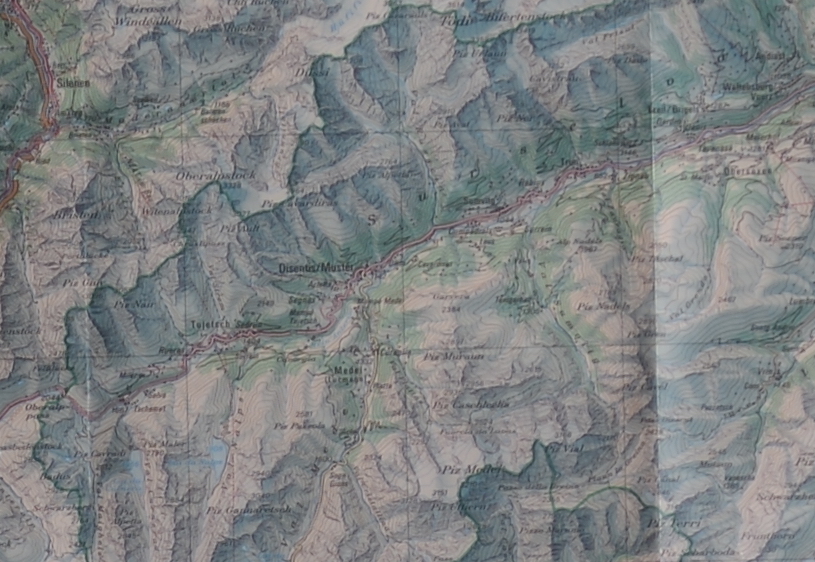
These are all the pictures I have, this time listed with the real names of the lenses. There are 6 shots for each, the middle and the corner(ish) shot with three different apertures. I have also included the Soligor 35-200 at 200mm which was not in the above comparisons.
Nikon 105
This is lens D in the comparisons. I have used the older auto focus version and it is actually the better performing lens here. This is not really so surprising. The one funny thing is the filter that changes the color slightly with this light.
Middle
Corner
Nikon 24-70
This is lens A in the comparisons. It is easily the most expensive lens in this comparison, even used it sells more than most of these lenses cost new. One thing to note is that we are using this lens at its longest 70mm and usually such zooms perform worse at their extreme ends. Just looking at the comparisons, you may not realize that this is one of the most praised lenses for the quality. There is absolutely nothing wrong with it, however it is more difficult to find situations where this lens outshines others significantly. It actually should show you that better equipment does not make you a better photographer, or your pictures will not improve that much when you pay 2 or 3 times more for a lens.
Middle
Corner
Nikon 85
This is lens E in the comparisons. First of all, this is a gorgeous lens, and here it looks horrible especially on the faster end. Part of this is that this lens has an aperture of f/1.8 and is technically 2x faster than the Nikon 24-70 and Nikon 105 and 4x or even more faster than the Soligor 35-200. So the comparison is a bit unfair. This should also show you that comparisons such as this one are not that useful. Well if it helps me prove this point, I guess this page is still helpful.
Middle
Corner
Soligor 35-200 at 70mm
This is lens C in the comparisons. I picked this one so that we can compare directly with Nikon 24-70. To be honest, while I was taking the pictures, I thought this would be a no-contest. I was wrong. While the fastest versions, especially on the corners look really washed up and there is a crazy falloff on the image, at f/8 things look actually very respectable (and better than some of the others).
Middle
Corner
Soligor 35-200 at 100mm
This is lens B in the comparisons. The focal length is approximate and the minimum aperture is only indicated, the actual aperture is probably smaller.
Middle
Corner
Soligor 35-200 at 200mm
These were not used for the comparison above as it was a bit too long. I have picked a different corner here just to show what the result is. Note that the crop was much larger than the other pictures so they are scaled to 1280 pixels. All other pictures are with the actual resolutions.
Middle
Corner
These pages are for Amateur Photographers and not really for seasoned photographers and professionals. I have no affiliation or commercial interest with any brand/make. I write from my own experience. I ended up using mainly Nikon, so I am more familiar with this brand than others. See price for notes on pricing as well as photography related links.
